Wow, just took a look at the contributions-sector.
Stunning! Sexy! Brilliant!
Maybe the is another collaboration in progress?
Sexy girls from the lagoon great artists
Re: Sexy girls from the lagoon great artists
shark wrote:.
Some various artwork by.... YO (a new nickname for....)
JimmyJohn? There's a similarity of appearances to my eye. Whoever it is, I like their style.
-

Greebo - Great Master of corals
- Posts: 2088
- Joined: Mon, 08Jan21 00:00
- Location: England
- sex: Masculine
Re: Sexy girls from the lagoon great artists
Just relaxing and she came out!
You do not have the required permissions to view the files attached to this post.
- rkshooter
- star of the reef
- Posts: 393
- Joined: Wed, 07Aug15 23:00
Re: Sexy girls from the lagoon great artists
Very nice! You should relax more often if that's the result, RKS ![pouce [img]smile/thumb.gif[/img]](./images/smilies/thumb.gif)
![pouce [img]smile/thumb.gif[/img]](./images/smilies/thumb.gif)
-

Greebo - Great Master of corals
- Posts: 2088
- Joined: Mon, 08Jan21 00:00
- Location: England
- sex: Masculine
Re: Sexy girls from the lagoon great artists
Just think how it'd be to come home after a difficult day to find that on the other side of the door...
Nicely done.
Nicely done.
-

LRM - Moderator
- Posts: 3058
- Joined: Wed, 09Apr22 23:00
- Location: Citizen of the world, residing in the USA
- sex: Masculine
Re: Sexy girls from the lagoon great artists
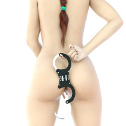
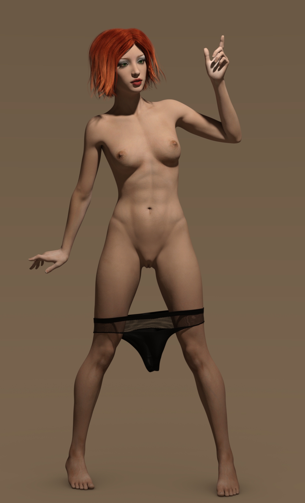
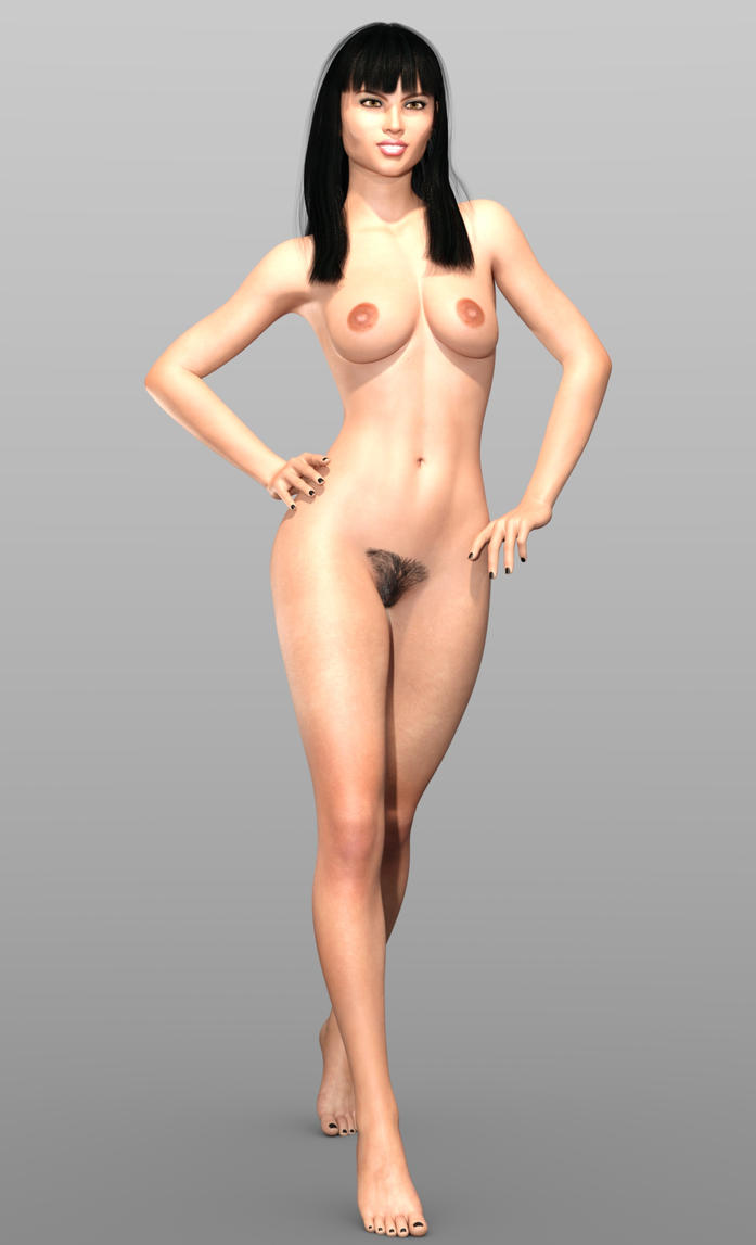
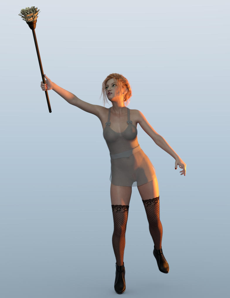
Just realised a couple of recent renders are of a suitable size to attach, so ...
Last edited by Ehlanna on Tue, 17May09 10:01, edited 3 times in total.
-
Ehlanna - star of the reef
- Posts: 423
- Joined: Thu, 10Apr22 23:00
- Location: Looking out the screen at you ... ;)
Re: Sexy girls from the lagoon great artists
Uh, Ehlanna -- what's the difference between the 1st and 2nd of those four? 

-

Greebo - Great Master of corals
- Posts: 2088
- Joined: Mon, 08Jan21 00:00
- Location: England
- sex: Masculine
Re: Sexy girls from the lagoon great artists
Greebo wrote:Uh, Ehlanna -- what's the difference between the 1st and 2nd of those four?
Um, ooops? Let's correct that shall we ..
 ANdded a couple more as 'compensation'
-

Ehlanna - star of the reef
- Posts: 423
- Joined: Thu, 10Apr22 23:00
- Location: Looking out the screen at you ... ;)
Re: Sexy girls from the lagoon great artists
Very good Ms E.
Except for needle she's carrying I prefer the nurse.
Except for needle she's carrying I prefer the nurse.
-

LRM - Moderator
- Posts: 3058
- Joined: Wed, 09Apr22 23:00
- Location: Citizen of the world, residing in the USA
- sex: Masculine
Re: Sexy girls from the lagoon great artists
Has a change taken place? Just tried to upload a couple more and been told size limit is 1000px wide - it had been 1200.
-

Ehlanna - star of the reef
- Posts: 423
- Joined: Thu, 10Apr22 23:00
- Location: Looking out the screen at you ... ;)
Re: Sexy girls from the lagoon great artists
Ehlanna wrote:Has a change taken place? Just tried to upload a couple more and been told size limit is 1000px wide - it had been 1200.
Ms E;
I asked the question and was told the limit has always been 1,000.
Please pare your art down and share it with us.
Lou
-

LRM - Moderator
- Posts: 3058
- Joined: Wed, 09Apr22 23:00
- Location: Citizen of the world, residing in the USA
- sex: Masculine
Re: Sexy girls from the lagoon great artists
Horribly confused then, as some of those images are 1200px in width!
Ahhh, I think I see the issue - such as it is - the full-size images are over the 1000px width limit, but the display of tan intermediate size which seems to use a different URL is within bounds!
Ahhh, I think I see the issue - such as it is - the full-size images are over the 1000px width limit, but the display of tan intermediate size which seems to use a different URL is within bounds!

-

Ehlanna - star of the reef
- Posts: 423
- Joined: Thu, 10Apr22 23:00
- Location: Looking out the screen at you ... ;)
Re: Sexy girls from the lagoon great artists
Ehlanna wrote:Just realised a couple of recent renders are of a suitable size to attach, so ...
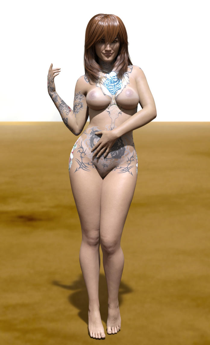
Pic 1
Pic 2
Pic 3
Pic 4
Pic 5
Pic 6
These are the renders I liked.
Pic 1 - really nice render, only thing I would say is, just above her clit, heading down towards her entrance looks to flat, almost rectangle, not natural looking.
Pic 2 - really like this render, change out the pale back ground for a study in a house, and have her dusting then and it would look great.
Pic 3 - is a nice render, I hate the red back ground, it does not do anything to improve the render, and I hate the pout on her lips, seems real life girls are all pouting in pictures now assuming it to be sexy.
Pic 4 - looks good, girl is a little over weight but natural looking, I think she would have looked better without the tats.
Pic 5 - looks great, I take it the red dot above her lip below her nose is a lip stud?, at first glance it looked like a pimple, there is slightly to much over spill of light on her feet and way to much tat work, but I like the render.
Pic 6 - lovely skin texture, not a fan of the pale back ground, put her into a bed room scene and the render becomes stunning then.
What work flow do You use?
-

PinkVendeta - legend of the South Seas
- Posts: 797
- Joined: Fri, 16May20 19:42
- sex: Female
Re: Sexy girls from the lagoon great artists
PinkVendeta wrote:These are the renders I liked.
Pic 1 - really nice render, only thing I would say is, just above her clit, heading down towards her entrance looks to flat, almost rectangle, not natural looking.
Pic 2 - really like this render, change out the pale back ground for a study in a house, and have her dusting then and it would look great.
Pic 3 - is a nice render, I hate the red back ground, it does not do anything to improve the render, and I hate the pout on her lips, seems real life girls are all pouting in pictures now assuming it to be sexy.
Pic 4 - looks good, girl is a little over weight but natural looking, I think she would have looked better without the tats.
Pic 5 - looks great, I take it the red dot above her lip below her nose is a lip stud?, at first glance it looked like a pimple, there is slightly to much over spill of light on her feet and way to much tat work, but I like the render.
Pic 6 - lovely skin texture, not a fan of the pale back ground, put her into a bed room scene and the render becomes stunning then.
What work flow do You use?
Thank you for the comments - the backgrounds, in general, are plain as I am just using a 'simple' HDRI light set for ambient light for speed purposes (most of these took lees than 10 minutes to render). The tats were 'by request' so .. hard to fulfil a request for them without having them, but YMMV on appreciating things like that. Ditto the 'overweight' - I'd say curvy; and if you think she is overweight what do you think about Marilyn Monroe?
 The lip thing is a pimple/mole thing - also one on her left-side chest IIRC.
Workflow is simple - for these it was load a G3F into Daz Studio; usually with a vague idea ahead of time of what sort of image I am after. Skin texture and morphing/shaping are next, done in either order as whim dictates Hair is done next, then on to clothes and posing. Lighting generally comes in at the end.
-

Ehlanna - star of the reef
- Posts: 423
- Joined: Thu, 10Apr22 23:00
- Location: Looking out the screen at you ... ;)
Who is online
Users browsing this forum: No registered users and 2 guests




![special [img]kator/smiley229.gif[/img]](./images/smilies/smiley229.gif)
